
A English
Textbook - Statistics and Probability Questions in English
Class 9 Mathematics · Statistics · Textbook - Statistics and Probability
42+
Questions
English
Language
100%
With Solutions
Showing 42 of 42 questions in English
1
Medium
Give five examples of data that you can collect from your day-to-day life.
Solution
(N/A) In our day-to-day life,we can collect the following data:
$1.$ Number of females per $1000$ males in various states of our country.
$2.$ Weights of students in our class.
$3.$ Production of wheat in the last $10$ years in our country.
$4.$ Number of plants in our locality.
$5.$ Rainfall in our city in the last $10$ years.
$1.$ Number of females per $1000$ males in various states of our country.
$2.$ Weights of students in our class.
$3.$ Production of wheat in the last $10$ years in our country.
$4.$ Number of plants in our locality.
$5.$ Rainfall in our city in the last $10$ years.
0 likes
View Solution2
Medium
Classify the data you can collect from your day-to-day life as primary or secondary data.
In our day-to-day life,we can collect the following data:
$1.$ Number of females per $1000$ males in various states of our country.
$2.$ Weights of students of our class.
$3.$ Production of wheat in the last $10$ years in our country.
$4.$ Number of plants in our locality.
$5.$ Rainfall in our city in the last $10$ years.
Solution
(N/A) The information which is collected by the investigator himself with a definite objective in his mind is called primary data. Conversely,when the information is gathered from a source that already has the information stored,it is called secondary data.
$1.$ Number of females per $1000$ males: Secondary data (collected from government records).
$2.$ Weights of students of our class: Primary data (collected by direct measurement).
$3.$ Production of wheat in the last $10$ years: Secondary data (collected from agricultural reports).
$4.$ Number of plants in our locality: Primary data (collected by direct observation).
$5.$ Rainfall in our city in the last $10$ years: Secondary data (collected from meteorological records).
Thus,$1, 3,$ and $5$ are secondary data,while $2$ and $4$ are primary data.
0 likes
View Solution3
Easy
Consider the marks obtained by $10$ students in a mathematics test as given below:
$55, 36, 95, 73, 60, 42, 25, 78, 75, 62$
$55, 36, 95, 73, 60, 42, 25, 78, 75, 62$
Solution
(N/A) The data in this form is called raw data.
By looking at it in this form,can you find the highest and the lowest marks?
Did it take you some time to search for the maximum and minimum scores? It would be less time-consuming if these scores were arranged in ascending or descending order. So,let us arrange the marks in ascending order as:
$25, 36, 42, 55, 60, 62, 73, 75, 78, 95$
Now,we can clearly see that the lowest marks are $25$ and the highest marks are $95$.
The difference between the highest and the lowest values in the data is called the range of the data. So,the range in this case is $95 - 25 = 70$.
Presentation of data in ascending or descending order can be quite time-consuming,particularly when the number of observations in an experiment is large.
0 likes
View Solution4
Medium
Consider the marks obtained (out of $100$ marks) by $30$ students of Class $IX$ of a school:
$\begin{array}{*{20}{c}}
{10}&{20}&{36}&{92}&{95}&{40}&{50}&{56}&{60}&{70} \\
{92}&{88}&{80}&{70}&{72}&{70}&{36}&{40}&{36}&{40} \\
{92}&{40}&{50}&{50}&{56}&{60}&{70}&{60}&{60}&{88}
\end{array}$
$\begin{array}{*{20}{c}}
{10}&{20}&{36}&{92}&{95}&{40}&{50}&{56}&{60}&{70} \\
{92}&{88}&{80}&{70}&{72}&{70}&{36}&{40}&{36}&{40} \\
{92}&{40}&{50}&{50}&{56}&{60}&{70}&{60}&{60}&{88}
\end{array}$
Solution
(N/A) Recall that the number of students who have obtained a certain number of marks is called the frequency of those marks. For instance,$4$ students got $70$ marks. So the frequency of $70$ marks is $4$. To make the data more easily understandable,we write it in a table,as given below:
This table is called an ungrouped frequency distribution table,or simply a frequency distribution table. Note that you can also use tally marks in preparing these tables.
| Marks | Number of students (i.e.,the frequency) |
| $10$ | $1$ |
| $20$ | $1$ |
| $36$ | $3$ |
| $40$ | $4$ |
| $50$ | $3$ |
| $56$ | $2$ |
| $60$ | $4$ |
| $70$ | $4$ |
| $72$ | $1$ |
| $80$ | $1$ |
| $88$ | $2$ |
| $92$ | $3$ |
| $95$ | $1$ |
| < strong>Total | $30$ |
This table is called an ungrouped frequency distribution table,or simply a frequency distribution table. Note that you can also use tally marks in preparing these tables.
0 likes
View Solution5
Medium
Van Mahotsava was celebrated in $100$ schools,where $100$ plants were planted in each school. After one month,the number of plants that survived were recorded as follows:
$\begin{array}{llllllllll}95 & 67 & 28 & 32 & 65 & 65 & 69 & 33 & 98 & 96 \\ 76 & 42 & 32 & 38 & 42 & 40 & 40 & 69 & 95 & 92 \\ 75 & 83 & 76 & 83 & 85 & 62 & 37 & 65 & 63 & 42 \\ 89 & 65 & 73 & 81 & 49 & 52 & 64 & 76 & 83 & 92 \\ 93 & 68 & 52 & 79 & 81 & 83 & 59 & 82 & 75 & 82 \\ 86 & 90 & 44 & 62 & 31 & 36 & 38 & 42 & 39 & 83 \\ 87 & 56 & 58 & 23 & 35 & 76 & 83 & 85 & 30 & 68 \\ 69 & 83 & 86 & 43 & 45 & 39 & 83 & 75 & 66 & 83 \\ 92 & 75 & 89 & 66 & 91 & 27 & 88 & 89 & 93 & 42 \\ 53 & 69 & 90 & 55 & 66 & 49 & 52 & 83 & 34 & 36\end{array}$
$\begin{array}{llllllllll}95 & 67 & 28 & 32 & 65 & 65 & 69 & 33 & 98 & 96 \\ 76 & 42 & 32 & 38 & 42 & 40 & 40 & 69 & 95 & 92 \\ 75 & 83 & 76 & 83 & 85 & 62 & 37 & 65 & 63 & 42 \\ 89 & 65 & 73 & 81 & 49 & 52 & 64 & 76 & 83 & 92 \\ 93 & 68 & 52 & 79 & 81 & 83 & 59 & 82 & 75 & 82 \\ 86 & 90 & 44 & 62 & 31 & 36 & 38 & 42 & 39 & 83 \\ 87 & 56 & 58 & 23 & 35 & 76 & 83 & 85 & 30 & 68 \\ 69 & 83 & 86 & 43 & 45 & 39 & 83 & 75 & 66 & 83 \\ 92 & 75 & 89 & 66 & 91 & 27 & 88 & 89 & 93 & 42 \\ 53 & 69 & 90 & 55 & 66 & 49 & 52 & 83 & 34 & 36\end{array}$
Solution
(N/A) To present such a large amount of data so that a reader can make sense of it easily,we condense it into groups like $20-29, 30-39, . . ., 90-99$ (since our data ranges from $23$ to $98$). These groupings are called 'classes' or 'class-intervals',and their size is called the class-size or class width,which is $10$ in this case. In each of these classes,the least number is called the 'lower class limit' and the greatest number is called the 'upper class limit'. For example,in $20-29$,$20$ is the lower class limit and $29$ is the upper class limit.
Using tally marks,the data above can be condensed into a grouped frequency distribution table as follows:
Presenting data in this form simplifies and condenses it,enabling us to observe important features at a glance. We can observe that $50\%$ or more plants survived in $8 + 18 + 10 + 23 + 12 = 71$ schools.
Using tally marks,the data above can be condensed into a grouped frequency distribution table as follows:
| Number of plants survived | Number of schools (frequency) |
| $20-29$ | $3$ |
| $30-39$ | $14$ |
| $40-49$ | $12$ |
| $50-59$ | $8$ |
| $60-69$ | $18$ |
| $70-79$ | $10$ |
| $80-89$ | $23$ |
| $90-99$ | $12$ |
| Total | $100$ |
Presenting data in this form simplifies and condenses it,enabling us to observe important features at a glance. We can observe that $50\%$ or more plants survived in $8 + 18 + 10 + 23 + 12 = 71$ schools.
0 likes
View Solution6
Difficult
Let us consider the following frequency distribution table which gives the weights of $38$ students of a class:
If two new students of weights $35.5\, kg$ and $40.5\, kg$ are admitted to this class,how should the frequency distribution table be adjusted to include them?
| Weights (in $kg$) | Number of students |
| $31-35$ | $9$ |
| $36-40$ | $5$ |
| $41-45$ | $14$ |
| $46-50$ | $3$ |
| $51-55$ | $1$ |
| $56-60$ | $2$ |
| $61-65$ | $2$ |
| $66-70$ | $1$ |
| $71-75$ | $1$ |
| Total | $38$ |
If two new students of weights $35.5\, kg$ and $40.5\, kg$ are admitted to this class,how should the frequency distribution table be adjusted to include them?
Solution
(N/A) To include weights like $35.5\, kg$ and $40.5\, kg$,we must convert the discontinuous class intervals into continuous ones.
$1$. Calculate the difference between the upper limit of a class and the lower limit of the next class (e.g.,$36 - 35 = 1$).
$2$. Divide this difference by $2$ to get the adjustment factor $(1 / 2 = 0.5)$.
$3$. Subtract $0.5$ from each lower limit and add $0.5$ to each upper limit to make the classes continuous.
The new continuous intervals are: $30.5-35.5, 35.5-40.5, 40.5-45.5, 45.5-50.5, 50.5-55.5, 55.5-60.5, 60.5-65.5, 65.5-70.5, 70.5-75.5$.
By convention,the upper limit value is included in the next class interval. Therefore,$35.5$ is included in $35.5-40.5$ and $40.5$ is included in $40.5-45.5$.
The updated table is:
| Weights (in $kg$) | Number of students |
| $30.5-35.5$ | $9$ |
| $35.5-40.5$ | $6$ |
| $40.5-45.5$ | $15$ |
| $45.5-50.5$ | $3$ |
| $50.5-55.5$ | $1$ |
| $55.5-60.5$ | $2$ |
| $60.5-65.5$ | $2$ |
| $65.5-70.5$ | $1$ |
| $70.5-75.5$ | $1$ |
| Total | $40$ |
0 likes
View Solution7
Medium
The blood groups of $30$ students of Class $VIII$ are recorded as follows:
$A, B, O, O, AB, O, A, O, B, A, O, B, A, O, O,$
$A, AB, O, A, A, O, O, AB, B, A, O, B, A, B, O.$
Represent this data in the form of a frequency distribution table. Which is the most common,and which is the rarest,blood group among these students?
$A, B, O, O, AB, O, A, O, B, A, O, B, A, O, O,$
$A, AB, O, A, A, O, O, AB, B, A, O, B, A, B, O.$
Represent this data in the form of a frequency distribution table. Which is the most common,and which is the rarest,blood group among these students?
Solution
(N/A) By counting the occurrences of each blood group in the given data,we find:
- Blood group $A$: $9$ students
- Blood group $B$: $6$ students
- Blood group $AB$: $3$ students
- Blood group $O$: $12$ students
Total number of students = $9 + 6 + 3 + 12 = 30$.
The frequency distribution table is as follows:
From the table,it is clear that the most common blood group is $O$ (with $12$ students) and the rarest blood group is $AB$ (with $3$ students).
- Blood group $A$: $9$ students
- Blood group $B$: $6$ students
- Blood group $AB$: $3$ students
- Blood group $O$: $12$ students
Total number of students = $9 + 6 + 3 + 12 = 30$.
The frequency distribution table is as follows:
| Blood group | Number of students |
| $A$ | $9$ |
| $B$ | $6$ |
| $AB$ | $3$ |
| $O$ | $12$ |
| Total | $30$ |
From the table,it is clear that the most common blood group is $O$ (with $12$ students) and the rarest blood group is $AB$ (with $3$ students).
0 likes
View Solution8
Medium
The distances (in $km$) of $40$ engineers from their residence to their place of work were found as follows:
Construct a grouped frequency distribution table with class size $5$ for the data given above,taking the first interval as $0-5$ ($5$ not included). What main features do you observe from this tabular representation?
| $5$ | $3$ | $10$ | $20$ | $25$ | $11$ | $13$ | $7$ | $12$ | $31$ |
| $19$ | $10$ | $12$ | $17$ | $18$ | $11$ | $32$ | $17$ | $16$ | $2$ |
| $7$ | $9$ | $7$ | $8$ | $3$ | $5$ | $12$ | $15$ | $18$ | $3$ |
| $12$ | $14$ | $2$ | $9$ | $6$ | $15$ | $15$ | $7$ | $6$ | $12$ |
Construct a grouped frequency distribution table with class size $5$ for the data given above,taking the first interval as $0-5$ ($5$ not included). What main features do you observe from this tabular representation?
Solution
(N/A) To construct a grouped frequency distribution table with a class size of $5$,we use intervals: $0-5, 5-10, 10-15, 15-20, 20-25, 25-30, 30-35$.
Observations:
$1$. Most of the engineers (i.e.,$5+11+11+9 = 36$ engineers) live within a distance of $20\, km$ from their workplace.
$2$. Very few engineers (i.e.,$1+1+2 = 4$ engineers) live at a distance of $20\, km$ or more from their workplace.
| Distance (in $km$) | Number of engineers |
| $0-5$ | $5$ |
| $5-10$ | $11$ |
| $10-15$ | $11$ |
| $15-20$ | $9$ |
| $20-25$ | $1$ |
| $25-30$ | $1$ |
| $30-35$ | $2$ |
| Total | $40$ |
Observations:
$1$. Most of the engineers (i.e.,$5+11+11+9 = 36$ engineers) live within a distance of $20\, km$ from their workplace.
$2$. Very few engineers (i.e.,$1+1+2 = 4$ engineers) live at a distance of $20\, km$ or more from their workplace.
0 likes
View Solution9
Medium
The relative humidity (in $\%$) of a certain city for a month of $30$ days was as follows:
$(i)$ Construct a grouped frequency distribution table with classes $84-86, 86-88$,etc.
$(ii)$ Which month or season do you think this data is about?
$(iii)$ What is the range of this data?
| $98.1$ | $98.6$ | $99.2$ | $90.3$ | $86.5$ | $95.3$ | $92.9$ | $96.3$ | $94.2$ | $95.1$ |
| $89.2$ | $92.3$ | $97.1$ | $93.5$ | $92.7$ | $95.1$ | $97.2$ | $93.3$ | $95.2$ | $97.3$ |
| $96.2$ | $92.1$ | $84.9$ | $90.2$ | $95.7$ | $98.3$ | $97.3$ | $96.1$ | $92.1$ | $89$ |
$(i)$ Construct a grouped frequency distribution table with classes $84-86, 86-88$,etc.
$(ii)$ Which month or season do you think this data is about?
$(iii)$ What is the range of this data?
Solution
(N/A) $(i)$ $A$ grouped frequency distribution table of class size $2$ is constructed. The class intervals are $84-86, 86-88, 88-90, \dots$
By observing the data,the frequency distribution table is as follows:
$(ii)$ It can be observed that the relative humidity is high. Therefore,the data is about a month of the rainy season.
$(iii)$ Range of data = Maximum value $-$ Minimum value = $99.2 - 84.9 = 14.3$.
By observing the data,the frequency distribution table is as follows:
| Relative humidity (in $\%$) | Number of days (frequency) |
| $84-86$ | $1$ |
| $86-88$ | $1$ |
| $88-90$ | $2$ |
| $90-92$ | $2$ |
| $92-94$ | $7$ |
| $94-96$ | $6$ |
| $96-98$ | $7$ |
| $98-100$ | $4$ |
| Total | $30$ |
$(ii)$ It can be observed that the relative humidity is high. Therefore,the data is about a month of the rainy season.
$(iii)$ Range of data = Maximum value $-$ Minimum value = $99.2 - 84.9 = 14.3$.
0 likes
View Solution10
Medium
The heights of $50$ students,measured to the nearest centimetres,have been found to be as follows:
$\begin{array}{llllllllll}161 & 150 & 154 & 165 & 168 & 161 & 154 & 162 & 150 & 151 \\ 162 & 164 & 171 & 165 & 158 & 154 & 156 & 172 & 160 & 170 \\ 153 & 159 & 161 & 170 & 162 & 165 & 166 & 168 & 165 & 164 \\ 154 & 152 & 153 & 156 & 158 & 162 & 160 & 161 & 173 & 166 \\ 161 & 159 & 162 & 167 & 168 & 159 & 158 & 153 & 154 & 159\end{array}$
$(i)$ Represent the data given above by a grouped frequency distribution table,taking the class intervals as $150-155, 155-160,$ etc.
$(ii)$ What can you conclude about their heights from the table?
Solution
(N/A) $(i)$ $A$ grouped frequency distribution table is constructed by taking class intervals of size $5$ starting from $150$. By tallying the data provided,we obtain the following frequency distribution table:
$(ii)$ From the table,it can be concluded that $35$ students (i.e.,$12+9+14 = 35$) have a height less than $165\, cm$. Since $35/50 = 70\%$,we can conclude that $70\%$ of the students are shorter than $165\, cm$.
| Height (in $cm$) | Number of students (frequency) |
| $150-155$ | $12$ |
| $155-160$ | $9$ |
| $160-165$ | $14$ |
| $165-170$ | $10$ |
| $170-175$ | $5$ |
| Total | $50$ |
$(ii)$ From the table,it can be concluded that $35$ students (i.e.,$12+9+14 = 35$) have a height less than $165\, cm$. Since $35/50 = 70\%$,we can conclude that $70\%$ of the students are shorter than $165\, cm$.
0 likes
View Solution11
Medium
$A$ study was conducted to find out the concentration of sulphur dioxide in the air in parts per million $(ppm)$ of a certain city. The data obtained for $30$ days is as follows:
$\begin{array}{llllll}0.03 & 0.08 & 0.08 & 0.09 & 0.04 & 0.17 \\ 0.16 & 0.05 & 0.02 & 0.06 & 0.18 & 0.20 \\ 0.11 & 0.08 & 0.12 & 0.13 & 0.22 & 0.07 \\ 0.08 & 0.01 & 0.10 & 0.06 & 0.09 & 0.18 \\ 0.11 & 0.07 & 0.05 & 0.07 & 0.01 & 0.04\end{array}$
$(i)$ Make a grouped frequency distribution table for this data with class intervals as $0.00 - 0.04, 0.04 - 0.08$,and so on.
$(ii)$ For how many days was the concentration of sulphur dioxide more than $0.11$ parts per million?
Solution
(8) To construct the grouped frequency distribution table,we count the number of observations falling into each class interval. Note that the upper limit of each class is excluded from that class.
$(ii)$ The number of days for which the concentration of $SO_2$ is more than $0.11$ $ppm$ corresponds to the sum of frequencies for the intervals $0.12 - 0.16, 0.16 - 0.20$,and $0.20 - 0.24$.
Required number of days $= 2 + 4 + 2 = 8$.
Therefore,for $8$ days,the concentration of $SO_2$ was more than $0.11$ $ppm$.
| Concentration of $SO_2$ (in $ppm$) | Number of days (frequency) |
| $0.00 - 0.04$ | $4$ |
| $0.04 - 0.08$ | $9$ |
| $0.08 - 0.12$ | $9$ |
| $0.12 - 0.16$ | $2$ |
| $0.16 - 0.20$ | $4$ |
| $0.20 - 0.24$ | $2$ |
| Total | $30$ |
$(ii)$ The number of days for which the concentration of $SO_2$ is more than $0.11$ $ppm$ corresponds to the sum of frequencies for the intervals $0.12 - 0.16, 0.16 - 0.20$,and $0.20 - 0.24$.
Required number of days $= 2 + 4 + 2 = 8$.
Therefore,for $8$ days,the concentration of $SO_2$ was more than $0.11$ $ppm$.
0 likes
View Solution12
Easy
Three coins were tossed $30$ times simultaneously. Each time the number of heads occurring was noted down as follows:
$\begin{array}{llllllllll}0 & 1 & 2 & 2 & 1 & 2 & 3 & 1 & 3 & 0 \\ 1 & 3 & 1 & 1 & 2 & 2 & 0 & 1 & 2 & 1 \\ 3 & 0 & 0 & 1 & 1 & 2 & 3 & 2 & 2 & 0\end{array}$
Prepare a frequency distribution table for the data given above.
$\begin{array}{llllllllll}0 & 1 & 2 & 2 & 1 & 2 & 3 & 1 & 3 & 0 \\ 1 & 3 & 1 & 1 & 2 & 2 & 0 & 1 & 2 & 1 \\ 3 & 0 & 0 & 1 & 1 & 2 & 3 & 2 & 2 & 0\end{array}$
Prepare a frequency distribution table for the data given above.
Solution
(N/A) To prepare the frequency distribution table,we count the occurrences of each outcome (number of heads) in the given data set.
$1$. Count of $0$ heads: $6$ times.
$2$. Count of $1$ head: $10$ times.
$3$. Count of $2$ heads: $9$ times.
$4$. Count of $3$ heads: $5$ times.
Sum of frequencies: $6 + 10 + 9 + 5 = 30$.
$1$. Count of $0$ heads: $6$ times.
$2$. Count of $1$ head: $10$ times.
$3$. Count of $2$ heads: $9$ times.
$4$. Count of $3$ heads: $5$ times.
Sum of frequencies: $6 + 10 + 9 + 5 = 30$.
| Number of heads | Number of times (frequency) |
| $0$ | $6$ |
| $1$ | $10$ |
| $2$ | $9$ |
| $3$ | $5$ |
| Total | $30$ |
0 likes
View Solution13
Difficult
The value of $\pi$ up to $50$ decimal places is given below:
$3.14159265358979323846264338327950288419716939937510$
$(i)$ Make a frequency distribution of the digits from $0$ to $9$ after the decimal point.
$(ii)$ What are the most and the least frequently occurring digits?
$3.14159265358979323846264338327950288419716939937510$
$(i)$ Make a frequency distribution of the digits from $0$ to $9$ after the decimal point.
$(ii)$ What are the most and the least frequently occurring digits?
Solution
(N/A) $(i)$ By observing the digits after the decimal point,the frequency distribution table is constructed as follows:
$(ii)$ From the table,the least frequency is $2$ (for digit $0$),and the maximum frequency is $8$ (for digits $3$ and $9$). Thus,the most frequently occurring digits are $3$ and $9$,and the least frequently occurring digit is $0$.
| Digit | Frequency |
| $0$ | $2$ |
| $1$ | $5$ |
| $2$ | $5$ |
| $3$ | $8$ |
| $4$ | $4$ |
| $5$ | $5$ |
| $6$ | $4$ |
| $7$ | $4$ |
| $8$ | $5$ |
| $9$ | $8$ |
| Total | $50$ |
$(ii)$ From the table,the least frequency is $2$ (for digit $0$),and the maximum frequency is $8$ (for digits $3$ and $9$). Thus,the most frequently occurring digits are $3$ and $9$,and the least frequently occurring digit is $0$.
0 likes
View Solution14
Medium
Thirty children were asked about the number of hours they watched $TV$ programmes in the previous week. The results were found as follows:
$\begin{array}{rrrrrrrrrr}1 & 6 & 2 & 3 & 5 & 12 & 5 & 8 & 4 & 8 \\ 10 & 3 & 4 & 12 & 2 & 8 & 15 & 1 & 17 & 6 \\ 3 & 2 & 8 & 5 & 9 & 6 & 8 & 7 & 14 & 12\end{array}$
$(i)$ Make a grouped frequency distribution table for this data,taking class width $5$ and one of the class intervals as $5-10$.
$(ii)$ How many children watched television for $15$ or more hours a week?
Solution
(N/A) $(i)$ The class intervals with a width of $5$ are $0-5, 5-10, 10-15, 15-20$.
The grouped frequency distribution table is as follows:
$(ii)$ The number of children who watched $TV$ for $15$ or more hours a week corresponds to the class interval $15-20$. From the table,this value is $2$.
The grouped frequency distribution table is as follows:
| Hours | Number of children |
|---|---|
| $0-5$ | $10$ |
| $5-10$ | $13$ |
| $10-15$ | $5$ |
| $15-20$ | $2$ |
| Total | $30$ |
$(ii)$ The number of children who watched $TV$ for $15$ or more hours a week corresponds to the class interval $15-20$. From the table,this value is $2$.
0 likes
View Solution15
Medium
$A$ company manufactures car batteries of a particular type. The lives (in years) of $40$ such batteries were recorded as follows:
$\begin{array}{llllllll}2.6 & 3.0 & 3.7 & 3.2 & 2.2 & 4.1 & 3.5 & 4.5 \\ 3.5 & 2.3 & 3.2 & 3.4 & 3.8 & 3.2 & 4.6 & 3.7 \\ 2.5 & 4.4 & 3.4 & 3.3 & 2.9 & 3.0 & 4.3 & 2.8 \\ 3.5 & 3.2 & 3.9 & 3.2 & 3.2 & 3.1 & 3.7 & 3.4 \\ 4.6 & 3.8 & 3.2 & 2.6 & 3.5 & 4.2 & 2.9 & 3.6\end{array}$
Construct a grouped frequency distribution table for this data,using class intervals of size $0.5$ starting from the interval $2 - 2.5$.
Solution
(N/A) To construct a grouped frequency distribution table with a class size of $0.5$,we start from the interval $2 - 2.5$.
The class intervals will be $2 - 2.5, 2.5 - 3.0, 3.0 - 3.5, 3.5 - 4.0, 4.0 - 4.5, 4.5 - 5.0$.
By tallying the data provided,we get the following frequency distribution table:
The class intervals will be $2 - 2.5, 2.5 - 3.0, 3.0 - 3.5, 3.5 - 4.0, 4.0 - 4.5, 4.5 - 5.0$.
By tallying the data provided,we get the following frequency distribution table:
| Lives of batteries (in years) | Number of batteries |
| $2.0 - 2.5$ | $2$ |
| $2.5 - 3.0$ | $6$ |
| $3.0 - 3.5$ | $14$ |
| $3.5 - 4.0$ | $11$ |
| $4.0 - 4.5$ | $4$ |
| $4.5 - 5.0$ | $3$ |
| Total | $40$ |
0 likes
View Solution16
Medium
In a particular section of Class $IX,$ $40$ students were asked about the months of their birth and the following graph was prepared for the data so obtained:
Observe the bar graph given above and answer the following questions:
$(i)$ How many students were born in the month of November?
$(ii)$ In which month were the maximum number of students born?
Observe the bar graph given above and answer the following questions:
$(i)$ How many students were born in the month of November?
$(ii)$ In which month were the maximum number of students born?
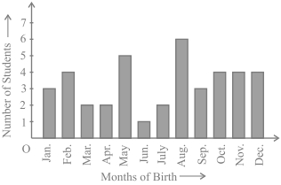
Solution
(N/A) Note that the variable here is the 'month of birth',and the value of the variable is the 'Number of students born'.
$(i)$ By observing the bar graph,the height of the bar corresponding to the month of November is $4$. Thus,$4$ students were born in the month of November.
$(ii)$ By observing the bar graph,the tallest bar corresponds to the month of August,which has a height of $6$. Thus,the maximum number of students were born in the month of August.
0 likes
View Solution17
Medium
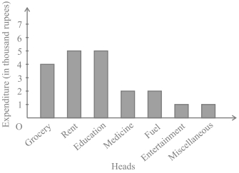
$A$ family with a monthly income of $20,000$ had planned the following expenditures per month under various heads:
Draw a bar graph for the data above.
| Heads | Expenditure (in thousand rupees) |
|---|---|
| Grocery | $4$ |
| Rent | $5$ |
| Education of children | $5$ |
| Medicine | $2$ |
| Fuel | $2$ |
| Entertainment | $1$ |
| Miscellaneous | $1$ |
Draw a bar graph for the data above.
Solution
(N/A) We draw the bar graph for this data in the following steps. Note that the unit in the second column is thousand rupees. So,'$4$' against 'Grocery' means $4000$ rupees.
$1.$ We represent the Heads (variable) on the horizontal axis,choosing any scale,since the width of the bar is not important. For clarity,we take equal widths for all bars and maintain equal gaps in between.
$2.$ We represent the expenditure (value) on the vertical axis. Since the maximum expenditure is $5000$,we can choose the scale as $1$ unit = $1000$ rupees.
$3.$ To represent our first Head,i.e.,Grocery,we draw a rectangular bar with width $1$ unit and height $4$ units.
$4.$ Similarly,other Heads are represented,leaving a gap of $1$ unit in between two consecutive bars.
Here,you can easily visualize the relative characteristics of the data at a glance,e.g.,the expenditure on education is more than double that of medical expenses. Therefore,in some ways,it serves as a better representation of data than the tabular form.
0 likes
View Solution18
Medium
$A$ teacher wanted to analyze the performance of two sections of students in a mathematics test of $100$ marks. Looking at their performances,she found that a few students got under $20$ marks and a few got $70$ marks or above. So she decided to group them into intervals of varying sizes as follows: $0-20, 20-30, ..., 60-70, 70-100$. Then she formed the following table:
$A$ histogram for this table was prepared by a student as shown in Fig. Carefully examine this graphical representation. Do you think that it correctly represents the data?
| Marks | Number of students |
| $0-20$ | $7$ |
| $20-30$ | $10$ |
| $30-40$ | $10$ |
| $40-50$ | $20$ |
| $50-60$ | $20$ |
| $60-70$ | $15$ |
| $70-100$ | $8$ |
| Total | $90$ |
$A$ histogram for this table was prepared by a student as shown in Fig. Carefully examine this graphical representation. Do you think that it correctly represents the data?
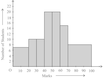
Solution
(N/A) No,the graph is giving us a misleading picture. In a histogram,the areas of the rectangles are proportional to the frequencies. This condition is satisfied when the widths of all class intervals are equal. However,in this case,the widths of the rectangles are varying,so the histogram does not give a correct representation. For example,it shows a greater frequency in the interval $70-100$ than in $60-70$,which is incorrect.
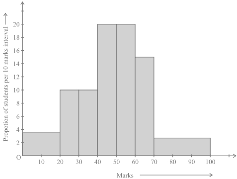
To correct this,we must modify the lengths of the rectangles so that their areas become proportional to the frequencies. The steps are:
$1$. Select the minimum class size,which is $10$ in this case.
$2$. Modify the lengths of the rectangles to be proportionate to the class size of $10$. For a class size of $20$,the length is $7$. For a class size of $10$,the length becomes $\frac{7}{20} \times 10 = 3.5$.
Following this method,we get the modified table:
These lengths represent the "proportion of students per $10$ marks interval". Plotting these values gives the correct histogram.
To correct this,we must modify the lengths of the rectangles so that their areas become proportional to the frequencies. The steps are:
$1$. Select the minimum class size,which is $10$ in this case.
$2$. Modify the lengths of the rectangles to be proportionate to the class size of $10$. For a class size of $20$,the length is $7$. For a class size of $10$,the length becomes $\frac{7}{20} \times 10 = 3.5$.
Following this method,we get the modified table:
| Marks | Frequency | Width | Length of rectangle |
| $0-20$ | $7$ | $20$ | $\frac{7}{20} \times 10 = 3.5$ |
| $20-30$ | $10$ | $10$ | $\frac{10}{10} \times 10 = 10$ |
| $30-40$ | $10$ | $10$ | $\frac{10}{10} \times 10 = 10$ |
| $40-50$ | $20$ | $10$ | $\frac{20}{10} \times 10 = 20$ |
| $50-60$ | $20$ | $10$ | $\frac{20}{10} \times 10 = 20$ |
| $60-70$ | $15$ | $10$ | $\frac{15}{10} \times 10 = 15$ |
| $70-100$ | $8$ | $30$ | $\frac{8}{30} \times 10 = 2.67$ |
These lengths represent the "proportion of students per $10$ marks interval". Plotting these values gives the correct histogram.
0 likes
View Solution19
Medium
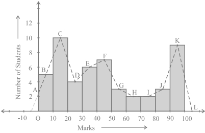
Consider the marks,out of $100$,obtained by $51$ students of a class in a test,given in the table below. Draw a frequency polygon corresponding to this frequency distribution table.
| Marks | Number of students |
| $0-10$ | $5$ |
| $10-20$ | $10$ |
| $20-30$ | $4$ |
| $30-40$ | $6$ |
| $40-50$ | $7$ |
| $50-60$ | $3$ |
| $60-70$ | $2$ |
| $70-80$ | $2$ |
| $80-90$ | $3$ |
| $90-100$ | $9$ |
| Total | $51$ |
Solution
(N/A) To draw a frequency polygon,we first represent the data using a histogram. We mark the mid-points of the tops of the rectangles as $B, C, D, E, F, G, H, I, J, K$ respectively.
Since the first class is $0-10$,to close the polygon,we extend the horizontal axis in the negative direction to include an imaginary class-interval $(-10) - 0$ with frequency $0$. We mark the mid-point of this interval as the starting point. The line segment from this point joins to the first mid-point $B$. Similarly,we take an imaginary class-interval $100-110$ with frequency $0$ and mark its mid-point $L$. The last mid-point $K$ is joined to $L$.
The resulting figure $OABCDEFGHIJKL$ is the required frequency polygon.
Alternatively,frequency polygons can be drawn using class-marks. The class-mark is calculated as:
$\text{Class-mark} = \frac{\text{Upper limit} + \text{Lower limit}}{2}$
0 likes
View Solution20
Medium
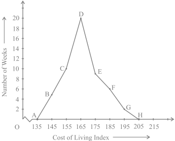
In a city,the weekly observations made in a study on the cost of living index are given in the following table:
Draw a frequency polygon for the data above (without constructing a histogram).
| Cost of living index | Number of weeks |
| $140-150$ | $5$ |
| $150-160$ | $10$ |
| $160-170$ | $20$ |
| $170-180$ | $9$ |
| $180-190$ | $6$ |
| $190-200$ | $2$ |
| Total | $52$ |
Draw a frequency polygon for the data above (without constructing a histogram).
Solution
(N/A) Since we want to draw a frequency polygon without a histogram,let us find the class-marks of the classes given above,that is of $140-150, 150-160, \dots$
For $140-150$,the upper limit $= 150$ and the lower limit $= 140$.
So,the class-mark $= \frac{150+140}{2} = \frac{290}{2} = 145$.
Continuing in the same manner,we find the class-marks of the other classes as well.
The new table obtained is as follows:
We can now draw a frequency polygon by plotting the class-marks along the horizontal axis,the frequencies along the vertical axis,and then plotting and joining the points $B(145, 5), C(155, 10), D(165, 20), E(175, 9), F(185, 6)$ and $G(195, 2)$ by line segments.
We should not forget to plot the point corresponding to the class-mark of the class $130-140$ (just before the lowest class $140-150$) with zero frequency,that is,$A(135, 0)$,and the point $H(205, 0)$ which occurs immediately after $G(195, 2)$.
So,the resultant frequency polygon will be $ABCDEFGH$.
For $140-150$,the upper limit $= 150$ and the lower limit $= 140$.
So,the class-mark $= \frac{150+140}{2} = \frac{290}{2} = 145$.
Continuing in the same manner,we find the class-marks of the other classes as well.
The new table obtained is as follows:
| Classes | Class-marks | Frequency |
| $140-150$ | $145$ | $5$ |
| $150-160$ | $155$ | $10$ |
| $160-170$ | $165$ | $20$ |
| $170-180$ | $175$ | $9$ |
| $180-190$ | $185$ | $6$ |
| $190-200$ | $195$ | $2$ |
We can now draw a frequency polygon by plotting the class-marks along the horizontal axis,the frequencies along the vertical axis,and then plotting and joining the points $B(145, 5), C(155, 10), D(165, 20), E(175, 9), F(185, 6)$ and $G(195, 2)$ by line segments.
We should not forget to plot the point corresponding to the class-mark of the class $130-140$ (just before the lowest class $140-150$) with zero frequency,that is,$A(135, 0)$,and the point $H(205, 0)$ which occurs immediately after $G(195, 2)$.
So,the resultant frequency polygon will be $ABCDEFGH$.
0 likes
View Solution21
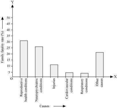
Medium
$A$ survey conducted by an organisation for the cause of illness and death among women between the ages $15-44$ (in years) worldwide,found the following figures (in $\%$):
$(i)$ Represent the information given above graphically.
$(ii)$ Which condition is the major cause of women's ill health and death worldwide?
$(iii)$ Try to find out,with the help of your teacher,any two factors which play a major role in the cause in $(ii)$ above being the major cause.
| $S$.No | Causes | Female fatality rate $(\%)$ |
| $1.$ | Reproductive health conditions | $31.8$ |
| $2.$ | Neuropsychiatric conditions | $25.4$ |
| $3.$ | Injuries | $12.4$ |
| $4.$ | Cardiovascular conditions | $4.3$ |
| $5.$ | Respiratory conditions | $4.1$ |
| $6.$ | Other causes | $22.0$ |
$(i)$ Represent the information given above graphically.
$(ii)$ Which condition is the major cause of women's ill health and death worldwide?
$(iii)$ Try to find out,with the help of your teacher,any two factors which play a major role in the cause in $(ii)$ above being the major cause.
Solution
(A) $(i)$ By representing causes on the $x-$axis and the female fatality rate on the $y-$axis and choosing an appropriate scale ($1 \text{ unit} = 5\%$ for the $y-$axis),a bar graph can be constructed.
$(ii)$ Reproductive health conditions are the major cause of women's ill health and death worldwide,as $31.8\%$ of women are affected by them.
$(iii)$ Two factors that play a major role in this are:
$1.$ Lack of access to quality medical facilities.
$2.$ Lack of awareness and correct knowledge regarding treatment and reproductive health.
0 likes
View Solution22
Medium
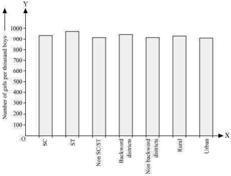
The following data on the number of girls (to the nearest ten) per thousand boys in different sections of Indian society is given below.
$(i)$ Represent the information above by a bar graph.
$(ii)$ In the classroom,discuss what conclusions can be arrived at from the graph.
| Section | Number of girls per thousand boys |
| Scheduled Caste $(SC)$ | $940$ |
| Scheduled Tribe $(ST)$ | $970$ |
| Non $SC/ST$ | $920$ |
| Backward districts | $950$ |
| Non-backward districts | $920$ |
| Rural | $930$ |
| Urban | $910$ |
$(i)$ Represent the information above by a bar graph.
$(ii)$ In the classroom,discuss what conclusions can be arrived at from the graph.
Solution
(N/A) $(i)$ By representing the section (variable) on the $x$-axis and the number of girls per thousand boys on the $y$-axis,the bar graph can be constructed by choosing an appropriate scale (e.g.,$1$ unit $= 100$ girls on the $y$-axis).
$(ii)$ From the graph,it can be observed that:
$1$. The maximum number of girls per thousand boys $(970)$ is in the $ST$ section.
$2$. The minimum number of girls per thousand boys $(910)$ is in urban areas.
$3$. The number of girls per thousand boys is higher in rural areas compared to urban areas.
$4$. The number of girls per thousand boys is higher in backward districts compared to non-backward districts.
$5$. The number of girls per thousand boys is higher in $SC$ and $ST$ sections compared to the non-$SC/ST$ section.
0 likes
View Solution23
Medium
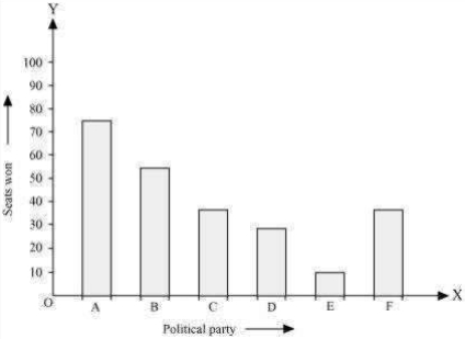
Given below are the seats won by different political parties in the polling outcome of a state assembly elections:
$(i)$ Draw a bar graph to represent the polling results.
$(ii)$ Which political party won the maximum number of seats?
| Political Party | $A$ | $B$ | $C$ | $D$ | $E$ | $F$ |
|---|---|---|---|---|---|---|
| Seats Won | $75$ | $55$ | $37$ | $29$ | $10$ | $37$ |
$(i)$ Draw a bar graph to represent the polling results.
$(ii)$ Which political party won the maximum number of seats?
Solution
(A) $(i)$ By taking political parties on the $x$-axis and seats won on the $y$-axis and choosing an appropriate scale ($1$ unit = $10$ seats for the $y$-axis),the required bar graph can be constructed as shown below.
Here,the rectangular bars are of equal width and have equal spacing between them.
$(ii)$ Political party '$A$' won the maximum number of seats ($75$ seats).
Here,the rectangular bars are of equal width and have equal spacing between them.
$(ii)$ Political party '$A$' won the maximum number of seats ($75$ seats).
0 likes
View Solution24
Medium
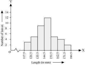
The lengths of $40$ leaves of a plant are measured correct to one millimetre,and the obtained data is represented in the following table:
$(i)$ Draw a histogram to represent the given data. [Hint: First make the class intervals continuous]
$(ii)$ Is there any other suitable graphical representation for the same data?
$(iii)$ Is it correct to conclude that the maximum number of leaves are $153 \, mm$ long? Why?
| Length (in $mm$) | Number of leaves |
| $118-126$ | $3$ |
| $127-135$ | $5$ |
| $136-144$ | $9$ |
| $145-153$ | $12$ |
| $154-162$ | $5$ |
| $163-171$ | $4$ |
| $172-180$ | $2$ |
$(i)$ Draw a histogram to represent the given data. [Hint: First make the class intervals continuous]
$(ii)$ Is there any other suitable graphical representation for the same data?
$(iii)$ Is it correct to conclude that the maximum number of leaves are $153 \, mm$ long? Why?
Solution
(N/A) $(i)$ It can be observed that the length of leaves is represented in a discontinuous class interval having a difference of $1$ between them.
Therefore,$1/2 = 0.5$ has to be added to each upper class limit and subtracted from each lower class limit to make the class intervals continuous.
Taking the length of leaves on the $x$-axis and the number of leaves on the $y$-axis,the histogram is drawn as shown in the figure.
$(ii)$ Another suitable graphical representation for this data is a frequency polygon.
$(iii)$ No,it is not correct. The maximum number of leaves $(12)$ have their lengths in the range of $144.5 \, mm$ to $153.5 \, mm$. It does not mean that all these leaves are $153 \, mm$ long.
Therefore,$1/2 = 0.5$ has to be added to each upper class limit and subtracted from each lower class limit to make the class intervals continuous.
| Length (in $mm$) | Number of leaves |
| $117.5-126.5$ | $3$ |
| $126.5-135.5$ | $5$ |
| $135.5-144.5$ | $9$ |
| $144.5-153.5$ | $12$ |
| $153.5-162.5$ | $5$ |
| $162.5-171.5$ | $4$ |
| $171.5-180.5$ | $2$ |
Taking the length of leaves on the $x$-axis and the number of leaves on the $y$-axis,the histogram is drawn as shown in the figure.
$(ii)$ Another suitable graphical representation for this data is a frequency polygon.
$(iii)$ No,it is not correct. The maximum number of leaves $(12)$ have their lengths in the range of $144.5 \, mm$ to $153.5 \, mm$. It does not mean that all these leaves are $153 \, mm$ long.
0 likes
View Solution25
Medium
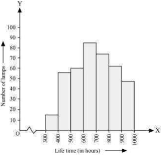
The following table gives the life times of $400$ neon lamps:
$(i)$ Represent the given information with the help of a histogram.
$(ii)$ How many lamps have a life time of more than $700$ hours?
| The time (in hours) | Number of lamps |
| $300-400$ | $14$ |
| $400-500$ | $56$ |
| $500-600$ | $60$ |
| $600-700$ | $86$ |
| $700-800$ | $74$ |
| $800-900$ | $62$ |
| $900-1000$ | $48$ |
$(i)$ Represent the given information with the help of a histogram.
$(ii)$ How many lamps have a life time of more than $700$ hours?
Solution
(N/A) $(i)$ By taking the life time (in hours) of neon lamps on the $x$-axis and the number of lamps on the $y$-axis,the histogram of the given information can be drawn as shown in the figure.
Here,$1$ unit on the $y$-axis represents $10$ lamps.
$(ii)$ The number of neon lamps having a lifetime of more than $700$ hours is the sum of the number of lamps in the intervals $700-800$,$800-900$,and $900-1000$.
Therefore,the number of neon lamps having a lifetime of more than $700$ hours is $74 + 62 + 48 = 184$.
0 likes
View Solution26
Medium
The following table gives the distribution of students of two sections according to the marks obtained by them:
Represent the marks of the students of both the sections on the same graph by two frequency polygons. From the two polygons,compare the performance of the two sections.
| Marks (Section $A$) | Frequency (Section $A$) | Marks (Section $B$) | Frequency (Section $B$) |
| $0-10$ | $3$ | $0-10$ | $5$ |
| $10-20$ | $9$ | $10-20$ | $19$ |
| $20-30$ | $17$ | $20-30$ | $15$ |
| $30-40$ | $12$ | $30-40$ | $10$ |
| $40-50$ | $9$ | $40-50$ | $1$ |
Represent the marks of the students of both the sections on the same graph by two frequency polygons. From the two polygons,compare the performance of the two sections.
Solution
(N/A) We can find the class marks of the given class intervals by using the following formula:
$\text{Class mark} = \frac{\text{Upper class limit} + \text{Lower class limit}}{2}$
By plotting the class marks on the $x$-axis and frequency on the $y$-axis,we draw the frequency polygons for both sections.
From the graph,it can be observed that the frequency polygon for section $A$ is shifted more towards the right compared to section $B$. This indicates that the students of section $A$ have performed better than the students of section $B$ in terms of obtaining higher marks.
$\text{Class mark} = \frac{\text{Upper class limit} + \text{Lower class limit}}{2}$
| Marks | Class mark | Frequency (Section $A$) | Frequency (Section $B$) |
| $0-10$ | $5$ | $3$ | $5$ |
| $10-20$ | $15$ | $9$ | $19$ |
| $20-30$ | $25$ | $17$ | $15$ |
| $30-40$ | $35$ | $12$ | $10$ |
| $40-50$ | $45$ | $9$ | $1$ |
By plotting the class marks on the $x$-axis and frequency on the $y$-axis,we draw the frequency polygons for both sections.
From the graph,it can be observed that the frequency polygon for section $A$ is shifted more towards the right compared to section $B$. This indicates that the students of section $A$ have performed better than the students of section $B$ in terms of obtaining higher marks.
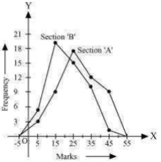
0 likes
View Solution27
Medium
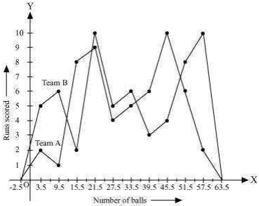
The runs scored by two teams $A$ and $B$ on the first $60$ balls in a cricket match are given below:
Represent the data of both the teams on the same graph by frequency polygons.
[Hint : First make the class intervals continuous.]
| Number of balls | Teams $A$ | Teams $B$ |
| $1-6$ | $2$ | $5$ |
| $7-12$ | $1$ | $6$ |
| $13-18$ | $8$ | $2$ |
| $19-24$ | $9$ | $10$ |
| $25-30$ | $4$ | $5$ |
| $31-36$ | $5$ | $6$ |
| $37-42$ | $6$ | $3$ |
| $43-48$ | $10$ | $4$ |
| $49-54$ | $6$ | $8$ |
| $55-60$ | $2$ | $10$ |
Represent the data of both the teams on the same graph by frequency polygons.
[Hint : First make the class intervals continuous.]
Solution
(N/A) It can be observed that the class intervals of the given data are not continuous.
There is a gap of $1$ in between them. Therefore,$1/2 = 0.5$ has to be added to the upper class limits and $0.5$ has to be subtracted from the lower class limits.
Also,the class mark of each interval can be found by using the following formula:
Class mark $= \frac{\text{Upper class limit} + \text{Lower class limit}}{2}$
Continuous data with the class mark of each class interval can be represented as follows:
By taking class marks on the $x$-axis and runs scored on the $y$-axis,a frequency polygon can be constructed as shown in the graph.
There is a gap of $1$ in between them. Therefore,$1/2 = 0.5$ has to be added to the upper class limits and $0.5$ has to be subtracted from the lower class limits.
Also,the class mark of each interval can be found by using the following formula:
Class mark $= \frac{\text{Upper class limit} + \text{Lower class limit}}{2}$
Continuous data with the class mark of each class interval can be represented as follows:
| Number of balls | Class mark | Team $A$ | Team $B$ |
| $0.5-6.5$ | $3.5$ | $2$ | $5$ |
| $6.5-12.5$ | $9.5$ | $1$ | $6$ |
| $12.5-18.5$ | $15.5$ | $8$ | $2$ |
| $18.5-24.5$ | $21.5$ | $9$ | $10$ |
| $24.5-30.5$ | $27.5$ | $4$ | $5$ |
| $30.5-36.5$ | $33.5$ | $5$ | $6$ |
| $36.5-42.5$ | $39.5$ | $6$ | $3$ |
| $42.5-48.5$ | $45.5$ | $10$ | $4$ |
| $48.5-54.5$ | $51.5$ | $6$ | $8$ |
| $54.5-60.5$ | $57.5$ | $2$ | $10$ |
By taking class marks on the $x$-axis and runs scored on the $y$-axis,a frequency polygon can be constructed as shown in the graph.
1 likes
View Solution28
Medium
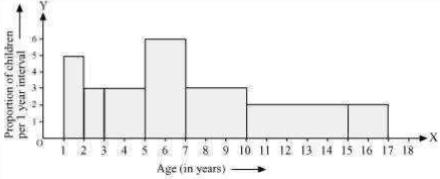
$A$ random survey of the number of children of various age groups playing in a park was found as follows:
Draw a histogram to represent the data above.
| Age (in years) | Number of children |
| $1-2$ | $5$ |
| $2-3$ | $3$ |
| $3-5$ | $6$ |
| $5-7$ | $12$ |
| $7-10$ | $9$ |
| $10-15$ | $10$ |
| $15-17$ | $4$ |
Draw a histogram to represent the data above.
Solution
(N/A) Here,it can be observed that the data has class intervals of varying width. The proportion of children per $1$ year interval can be calculated as follows:
Taking the age of children on the $x$-axis and the proportion of children per $1$ year interval on the $y$-axis,the histogram is constructed based on the calculated heights.
| Age (in years) | Number of children | Width of class | Height of rectangle |
| $1-2$ | $5$ | $1$ | $(5 \times 1) / 1 = 5$ |
| $2-3$ | $3$ | $1$ | $(3 \times 1) / 1 = 3$ |
| $3-5$ | $6$ | $2$ | $(6 \times 1) / 2 = 3$ |
| $5-7$ | $12$ | $2$ | $(12 \times 1) / 2 = 6$ |
| $7-10$ | $9$ | $3$ | $(9 \times 1) / 3 = 3$ |
| $10-15$ | $10$ | $5$ | $(10 \times 1) / 5 = 2$ |
| $15-17$ | $4$ | $2$ | $(4 \times 1) / 2 = 2$ |
Taking the age of children on the $x$-axis and the proportion of children per $1$ year interval on the $y$-axis,the histogram is constructed based on the calculated heights.
0 likes
View Solution29
Medium
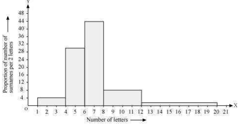
$100$ surnames were randomly picked up from a local telephone directory and a frequency distribution of the number of letters in the English alphabet in the surnames was found as follows:
$(i)$ Draw a histogram to depict the given information.
$(ii)$ Write the class interval in which the maximum number of surnames lie.
| Number of letters | Number of surnames |
| $1-4$ | $6$ |
| $4-6$ | $30$ |
| $6-8$ | $44$ |
| $8-12$ | $16$ |
| $12-20$ | $4$ |
$(i)$ Draw a histogram to depict the given information.
$(ii)$ Write the class interval in which the maximum number of surnames lie.
Solution
(N/A) $(i)$ Here,it can be observed that the data has class intervals of varying width. The proportion of the number of surnames per $2$ letters interval can be calculated as follows:
By taking the number of letters on the $x$-axis and the proportion of the number of surnames per $2$ letters interval on the $y$-axis,the histogram is constructed as shown in the provided image.
$(ii)$ The class interval in which the maximum number of surnames lies is $6-8$,as it contains $44$ surnames,which is the maximum frequency for this data.
| Number of letters | Frequency (Number of surnames) | Width of class | Length of rectangle |
| $1-4$ | $6$ | $3$ | $\frac{6 \times 2}{3} = 4$ |
| $4-6$ | $30$ | $2$ | $\frac{30 \times 2}{2} = 30$ |
| $6-8$ | $44$ | $2$ | $\frac{44 \times 2}{2} = 44$ |
| $8-12$ | $16$ | $4$ | $\frac{16 \times 2}{4} = 8$ |
| $12-20$ | $4$ | $8$ | $\frac{4 \times 2}{8} = 1$ |
By taking the number of letters on the $x$-axis and the proportion of the number of surnames per $2$ letters interval on the $y$-axis,the histogram is constructed as shown in the provided image.
$(ii)$ The class interval in which the maximum number of surnames lies is $6-8$,as it contains $44$ surnames,which is the maximum frequency for this data.
1 likes
View Solution30
Medium
$5$ people were asked about the time in a week they spend doing social work in their community. They said $10, 7, 13, 20$ and $15$ hours,respectively. Find the mean (or average) time in a week devoted by them for social work.
Solution
(13) The mean (or average) of a set of observations is calculated as the sum of all observations divided by the total number of observations.
Let $x_i$ denote the $i$-th observation. Here,we have $5$ observations: $x_1 = 10, x_2 = 7, x_3 = 13, x_4 = 20, x_5 = 15$.
The mean $\bar{x}$ is given by the formula:
$\bar{x} = \frac{\sum_{i=1}^{n} x_i}{n}$
Substituting the values:
$\bar{x} = \frac{10 + 7 + 13 + 20 + 15}{5}$
$\bar{x} = \frac{65}{5} = 13$
Thus,the mean time spent by these $5$ people in doing social work is $13$ hours in a week.
0 likes
View Solution31
MediumMCQ
Find the mean of the marks obtained by $30$ students of Class $IX$ of a school.
$\begin{array}{llllllllll}10 & 20 & 36 & 92 & 95 & 40 & 50 & 56 & 60 & 70 \\ 92 & 88 & 80 & 70 & 72 & 70 & 36 & 40 & 36 & 40 \\ 92 & 40 & 50 & 50 & 56 & 60 & 70 & 60 & 60 & 88\end{array}$
$\begin{array}{llllllllll}10 & 20 & 36 & 92 & 95 & 40 & 50 & 56 & 60 & 70 \\ 92 & 88 & 80 & 70 & 72 & 70 & 36 & 40 & 36 & 40 \\ 92 & 40 & 50 & 50 & 56 & 60 & 70 & 60 & 60 & 88\end{array}$
A
$66.3$
B
$60.5$
C
$59.3$
D
$95.8$
Solution
(C) The mean (average) of a set of observations is calculated by dividing the sum of all observations by the total number of observations.
Formula: $\bar{x} = \frac{\sum_{i=1}^{n} x_i}{n}$
Given,the number of students $n = 30$.
Sum of all marks = $10 + 20 + 36 + 92 + 95 + 40 + 50 + 56 + 60 + 70 + 92 + 88 + 80 + 70 + 72 + 70 + 36 + 40 + 36 + 40 + 92 + 40 + 50 + 50 + 56 + 60 + 70 + 60 + 60 + 88 = 1779$.
Mean $\bar{x} = \frac{1779}{30} = 59.3$.
0 likes
View Solution32
MediumMCQ
The heights (in $cm$) of $9$ students of a class are as follows:
$155, 160, 145, 149, 150, 147, 152, 144, 148$
Find the median of this data. (in $\text{ cm}$)
$155, 160, 145, 149, 150, 147, 152, 144, 148$
Find the median of this data. (in $\text{ cm}$)
A
$149$
B
$145$
C
$199$
D
$139$
Solution
(A) First,we arrange the given data in ascending order:
$144, 145, 147, 148, 149, 150, 152, 155, 160$
Since the number of observations $(n)$ is $9$,which is an odd number,the median is the value of the $\left(\frac{n+1}{2}\right)^{th}$ observation.
Median $= \left(\frac{9+1}{2}\right)^{th} = \left(\frac{10}{2}\right)^{th} = 5^{th}$ observation.
The $5^{th}$ observation in the ordered data is $149$.
Therefore,the median height is $149 \text{ cm}$.
0 likes
View Solution33
MediumMCQ
The points scored by a Kabaddi team in a series of matches are as follows:
$17, 2, 7, 27, 15, 5, 14, 8, 10, 24, 48, 10, 8, 7, 18, 28$
Find the median of the points scored by the team.
$17, 2, 7, 27, 15, 5, 14, 8, 10, 24, 48, 10, 8, 7, 18, 28$
Find the median of the points scored by the team.
A
$10$
B
$12$
C
$14$
D
$15$
Solution
(B) Arranging the points scored by the team in ascending order,we get:
$2, 5, 7, 7, 8, 8, 10, 10, 14, 15, 17, 18, 24, 27, 28, 48$.
There are $n = 16$ terms,which is an even number.
For an even number of observations,the median is the mean of the $(\frac{n}{2})$th and $(\frac{n}{2} + 1)$th terms.
Here,the $8$th term is $10$ and the $9$th term is $14$.
Median $= \frac{10 + 14}{2} = \frac{24}{2} = 12$.
Thus,the median of the points scored by the Kabaddi team is $12$.
0 likes
View Solution34
MediumMCQ
Find the mode of the following marks (out of $10$) obtained by $20$ students:
$4, 6, 5, 9, 3, 2, 7, 7, 6, 5, 4, 9, 10, 10, 3, 4, 7, 6, 9, 9$
$4, 6, 5, 9, 3, 2, 7, 7, 6, 5, 4, 9, 10, 10, 3, 4, 7, 6, 9, 9$
A
$6$
B
$7$
C
$9$
D
$10$
Solution
(C) To find the mode,we first arrange the given data in ascending order:
$2, 3, 3, 4, 4, 4, 5, 5, 6, 6, 6, 7, 7, 7, 9, 9, 9, 9, 10, 10$
Next,we count the frequency of each observation:
$2$ appears $1$ time.
$3$ appears $2$ times.
$4$ appears $3$ times.
$5$ appears $2$ times.
$6$ appears $3$ times.
$7$ appears $3$ times.
$9$ appears $4$ times.
$10$ appears $2$ times.
The mode is the observation that occurs most frequently. Since $9$ appears $4$ times,which is the highest frequency,the mode is $9$.
0 likes
View Solution35
Medium
Consider a small unit of a factory where there are $5$ employees: a supervisor and four labourers. The labourers draw a salary of $Rs. 5,000$ per month each,while the supervisor gets $Rs. 15,000$ per month. Calculate the mean,median,and mode of the salaries of this unit of the factory.
Solution
(A) Mean = $\frac{5000+5000+5000+5000+15000}{5} = \frac{35000}{5} = 7000$.
So,the mean salary is $Rs. 7000$ per month.
To obtain the median,we arrange the salaries in ascending order:
$5000, 5000, 5000, 5000, 15000$.
Since the number of employees in the factory is $5$,the median is given by the $\left(\frac{5+1}{2}\right)^{th} = 3^{rd}$ observation.
Therefore,the median is $Rs. 5000$ per month.
To find the mode of the salaries,we observe that $5000$ occurs the maximum number of times in the data. So,the modal salary is $Rs. 5000$ per month.
Comparing the three measures of central tendency,we see that the mean salary of $Rs. 7000$ does not give an accurate estimate of the wages of the majority,while the median and mode of $Rs. 5000$ represent the data more effectively. Extreme values in the data affect the mean,which is a weakness of this measure.
0 likes
View Solution36
Medium
The following number of goals were scored by a team in a series of $10$ matches:
$2, 3, 4, 5, 0, 1, 3, 3, 4, 3$
Find the mean,median,and mode of these scores.
$2, 3, 4, 5, 0, 1, 3, 3, 4, 3$
Find the mean,median,and mode of these scores.
Solution
(D) The number of goals scored by the team is:
$2, 3, 4, 5, 0, 1, 3, 3, 4, 3$
Mean of data = $\frac{\text{Sum of all observations}}{\text{Total number of observations}}$
Mean score = $\frac{2+3+4+5+0+1+3+3+4+3}{10} = \frac{28}{10} = 2.8$ goals.
Arranging the number of goals in ascending order:
$0, 1, 2, 3, 3, 3, 3, 4, 4, 5$
The number of observations is $n = 10$,which is an even number.
Therefore,the median is the mean of the $(\frac{n}{2})^{th}$ and $(\frac{n}{2} + 1)^{th}$ observations.
Median = $\frac{5^{th} \text{ observation} + 6^{th} \text{ observation}}{2} = \frac{3 + 3}{2} = \frac{6}{2} = 3$.
Mode is the observation with the maximum frequency.
In the given data,the value $3$ appears $4$ times,which is the maximum frequency.
Therefore,the mode is $3$.
0 likes
View Solution37
Medium
In a mathematics test given to $15$ students,the following marks (out of $100$) are recorded:
$41, 39, 48, 52, 46, 62, 54, 40, 96, 52, 98, 40, 42, 52, 60$
Find the mean,median,and mode of this data.
$41, 39, 48, 52, 46, 62, 54, 40, 96, 52, 98, 40, 42, 52, 60$
Find the mean,median,and mode of this data.
Solution
(N/A) The marks of $15$ students in the mathematics test are:
$41, 39, 48, 52, 46, 62, 54, 40, 96, 52, 98, 40, 42, 52, 60$
$1.$ Mean of data = (Sum of all observations) / (Total number of observations)
$= (41 + 39 + 48 + 52 + 46 + 62 + 54 + 40 + 96 + 52 + 98 + 40 + 42 + 52 + 60) / 15$
$= 822 / 15 = 54.8$
$2.$ Arranging the scores in ascending order:
$39, 40, 40, 41, 42, 46, 48, 52, 52, 52, 54, 60, 62, 96, 98$
Since the number of observations $n = 15$ (which is odd),the median is the value of the $((n+1)/2)^{\text{th}}$ observation.
Median = $((15+1)/2)^{\text{th}} = 8^{\text{th}}$ observation.
The $8^{\text{th}}$ observation is $52$.
$3.$ Mode is the observation with the maximum frequency.
Here,$52$ appears $3$ times,which is the highest frequency.
Therefore,the mode is $52$.
0 likes
View Solution38
EasyMCQ
The following observations have been arranged in ascending order. If the median of the data is $63$,find the value of $x.$
$29, 32, 48, 50, x, x+ 2, 72, 78, 84, 95$
$29, 32, 48, 50, x, x+ 2, 72, 78, 84, 95$
A
$62$
B
$60$
C
$66$
D
$68$
Solution
(A) The total number of observations $(n)$ is $10$,which is an even number.
For an even number of observations,the median is the mean of the $(\frac{n}{2})^{th}$ and $(\frac{n}{2} + 1)^{th}$ observations.
Here,$n = 10$,so the median is the mean of the $5^{th}$ and $6^{th}$ observations.
$5^{th}$ observation = $x$
$6^{th}$ observation = $x + 2$
Median = $\frac{x + (x + 2)}{2} = 63$
$\frac{2x + 2}{2} = 63$
$x + 1 = 63$
$x = 62$
0 likes
View Solution39
EasyMCQ
Find the mode of $14, 25, 14, 28, 18, 17, 18, 14, 23, 22, 14, 18.$
A
$19$
B
$14$
C
$16$
D
$18$
Solution
(B) Arranging the data in ascending order:
$14, 14, 14, 14, 17, 18, 18, 18, 22, 23, 25, 28$
It can be observed that the number $14$ appears $4$ times,which is the highest frequency in the given data set.
Therefore,the mode of the given data is $14$.
$14, 14, 14, 14, 17, 18, 18, 18, 22, 23, 25, 28$
It can be observed that the number $14$ appears $4$ times,which is the highest frequency in the given data set.
Therefore,the mode of the given data is $14$.
0 likes
View Solution40
DifficultMCQ
Find the mean salary of $60$ workers of a factory from the following table:
| Salary (in Rs.) | Number of workers |
| $3000$ | $16$ |
| $4000$ | $12$ |
| $5000$ | $10$ |
| $6000$ | $8$ |
| $7000$ | $6$ |
| $8000$ | $4$ |
| $9000$ | $3$ |
| $10000$ | $1$ |
| Total | $60$ |
A
$508.36$
B
$83.33$
C
$5083.33$
D
$50.25$
Solution
(C) The mean salary can be calculated using the formula:
Mean $= \frac{\sum f_{i} x_{i}}{\sum f_{i}}$
We calculate the product of salary $(x_i)$ and number of workers $(f_i)$ for each group:
Given $\sum f_{i} = 60$.
Mean salary $= \frac{305000}{60} = 5083.33$.
Therefore,the mean salary of $60$ workers is Rs $5083.33$.
Mean $= \frac{\sum f_{i} x_{i}}{\sum f_{i}}$
We calculate the product of salary $(x_i)$ and number of workers $(f_i)$ for each group:
| Salary $(x_i)$ | $f_i x_i$ |
| $3000$ | $3000 \times 16 = 48000$ |
| $4000$ | $4000 \times 12 = 48000$ |
| $5000$ | $5000 \times 10 = 50000$ |
| $6000$ | $6000 \times 8 = 48000$ |
| $7000$ | $7000 \times 6 = 42000$ |
| $8000$ | $8000 \times 4 = 32000$ |
| $9000$ | $9000 \times 3 = 27000$ |
| $10000$ | $10000 \times 1 = 10000$ |
| Total | $\sum f_{i} x_{i} = 305000$ |
Given $\sum f_{i} = 60$.
Mean salary $= \frac{305000}{60} = 5083.33$.
Therefore,the mean salary of $60$ workers is Rs $5083.33$.
0 likes
View Solution41
Easy
Give one example of a situation in which $(i)$ the mean is an appropriate measure of central tendency.
Solution
(N/A) The mean is an appropriate measure of central tendency when the data set does not contain extreme outliers and the values are relatively close to each other.
$(i)$ Consider the following example: The heights of the members of a family are $154.9 \text{ cm}, 162.8 \text{ cm}, 170.6 \text{ cm}, 158.8 \text{ cm}, 163.3 \text{ cm}, 166.8 \text{ cm}, 160.2 \text{ cm}$.
In this case,it can be observed that the observations in the given data are close to each other and there are no extreme values. Therefore,the mean is an appropriate measure of central tendency.
0 likes
View Solution42
Easy
Give one example of a situation in which $(i)$ the mean is not an appropriate measure of central tendency but the median is an appropriate measure of central tendency.
Solution
(N/A) When a data set contains a few observations that are significantly distant from the rest of the data (outliers),the mean is heavily influenced by these extreme values,making it an inappropriate measure of central tendency. In such cases,the median is a more robust and appropriate measure.
Consider the following data representing the marks obtained by $12$ students in a test:
$48, 59, 46, 52, 54, 46, 97, 42, 49, 58, 60, 99$
In this data set,the values $97$ and $99$ are significantly higher than the other marks. Because of these extreme values,the mean would be skewed upwards,failing to represent the typical performance of the students. Therefore,the median is a more appropriate measure of central tendency for this data.
0 likes
View SolutionStatistics — Textbook - Statistics and Probability · Frequently Asked Questions
1Are these Statistics questions useful for JEE and NEET?
Yes. All questions in this section are mapped to JEE Main and NEET exam patterns. Previous year questions from JEE Main, NEET, GUJCET and state-level exams are included with full solutions.
2Can I switch to Hindi or Gujarati for these questions?
Yes. Use the language tabs in the hero section or the sidebar to view the same questions and solutions in English, Hindi or Gujarati.
3How do I generate a question paper from this subtopic?
Use the Vedclass Exam Paper Generator — select the chapter and subtopic, set difficulty, and generate Sets A, B, C, D automatically. First 3 chapters of every subject are free.
Vedclass Products
For Students
Vedclass Test Series
Mock tests in real JEE/NEET style with performance analysis. 5-day free trial.
Start Free TrialFor Teachers
Exam Paper Generator
Generate Set A/B/C/D papers from this chapter in 2 minutes. 3 chapters free.
Try FreeFor Institutes
Online Exam Module
Live online exams with unlimited students, 360° analytics & white-label branding.
See DemoFor Teachers & Institutes
Generate a Statistics Exam Paper in 2 Minutes
Select subtopic & difficulty — Sets A, B, C, D auto-generated with No Repeat logic.
First 3 chapters of every subject are free — no payment required.